%404x.png)
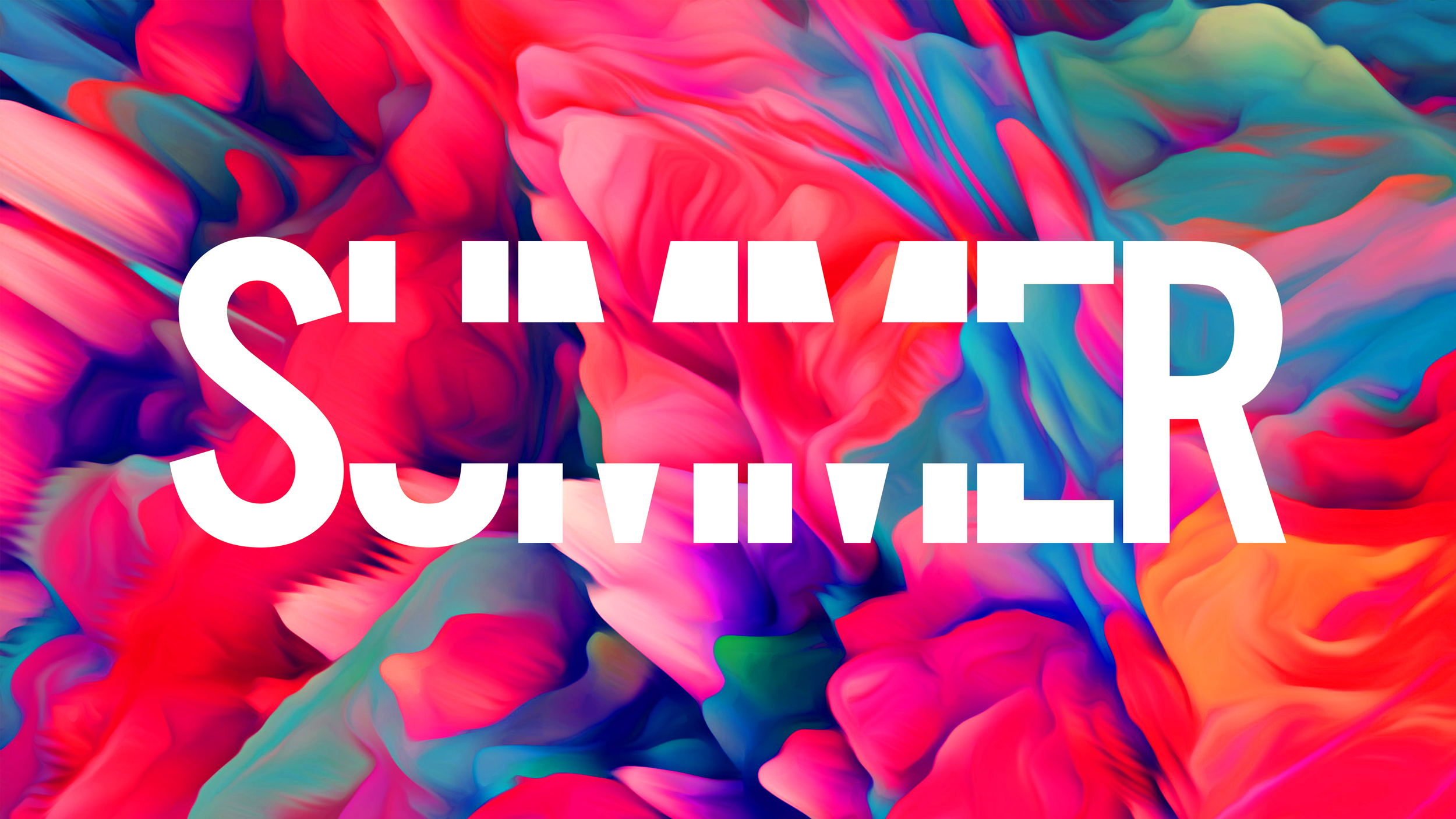
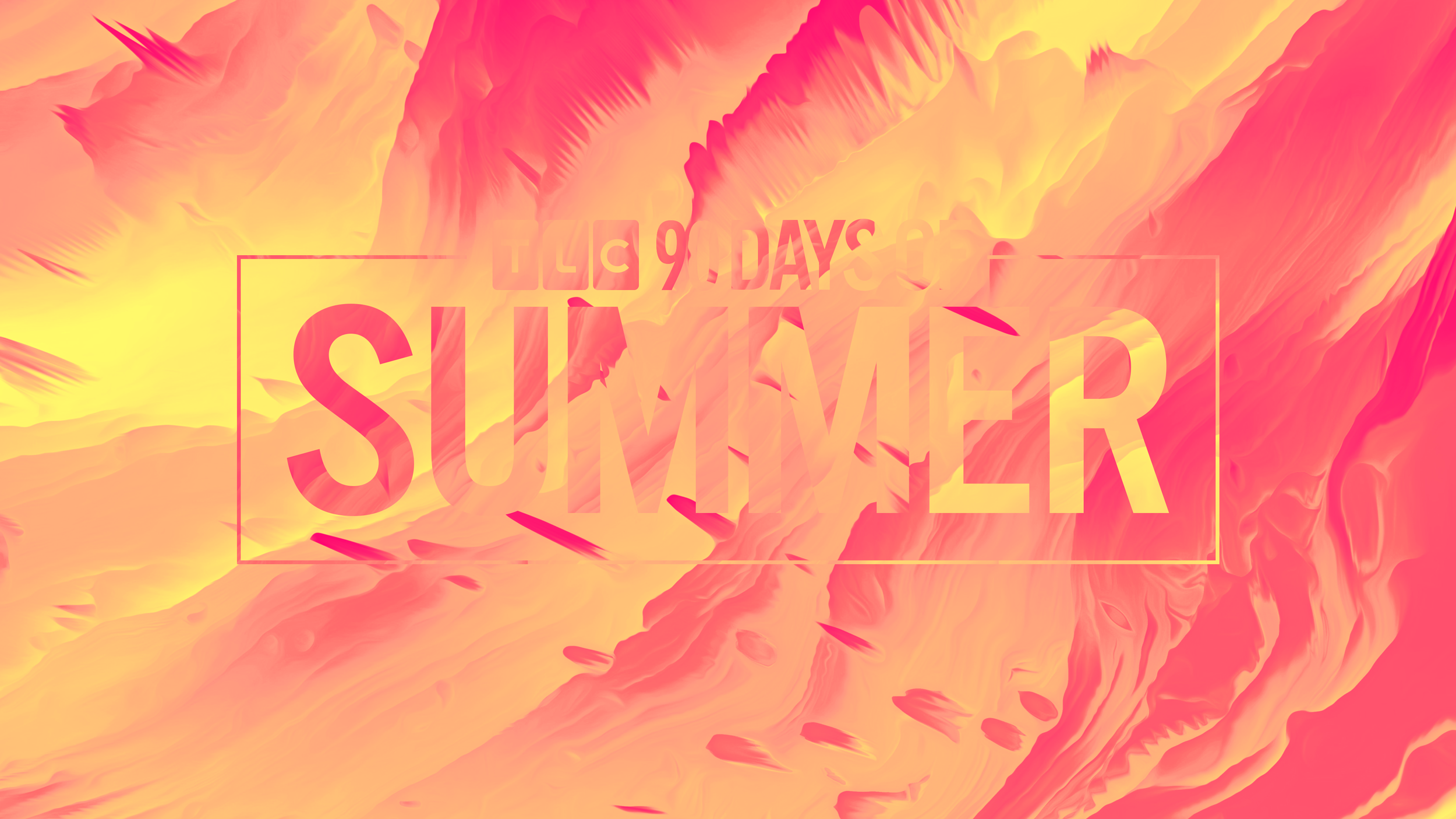
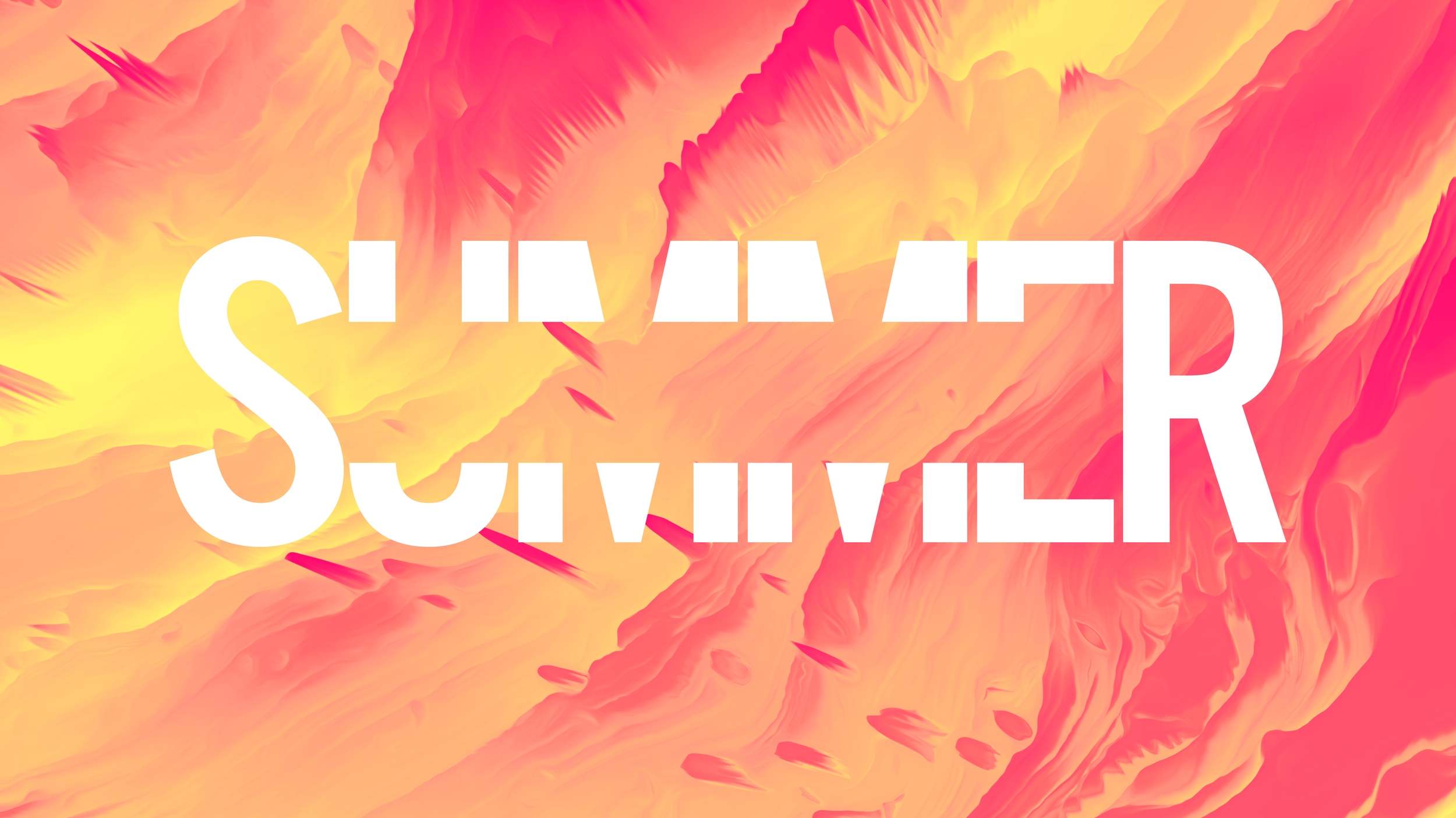
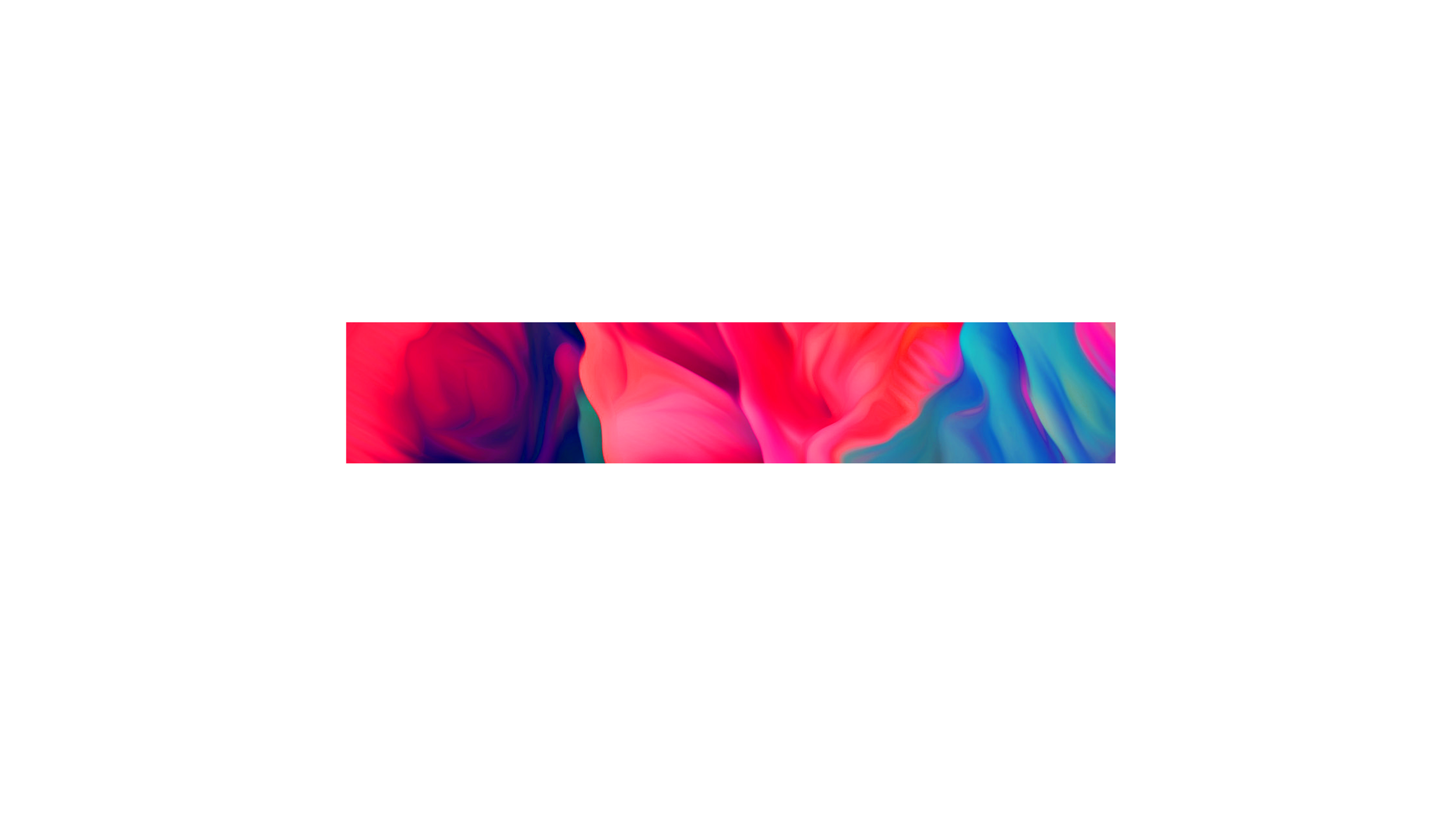
Yeah — the visuals are way more specific than just “90s-inspired.” I’d describe it as fiery, psychedelic, saturated, and summer-chaotic.
The Brief:
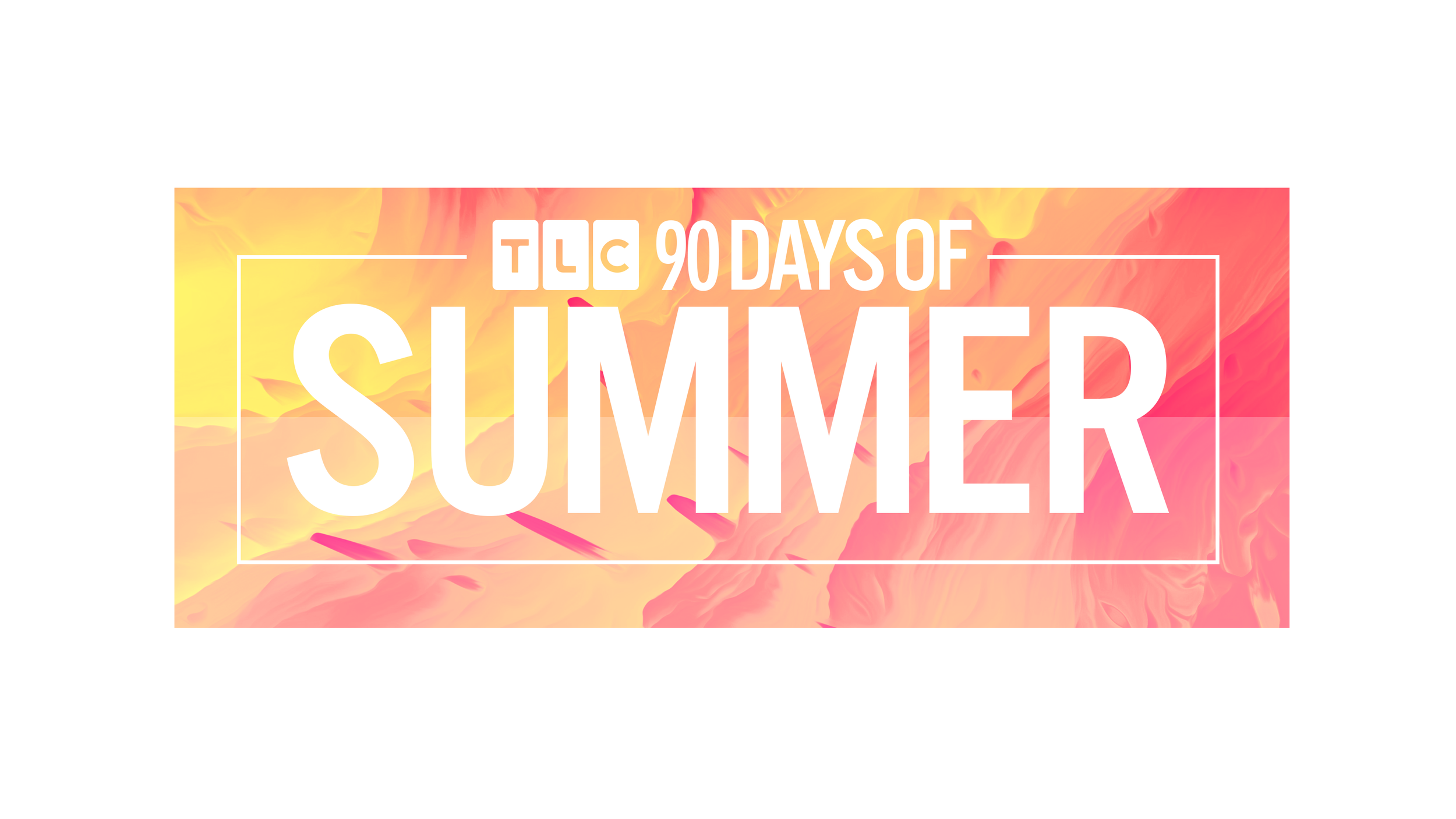
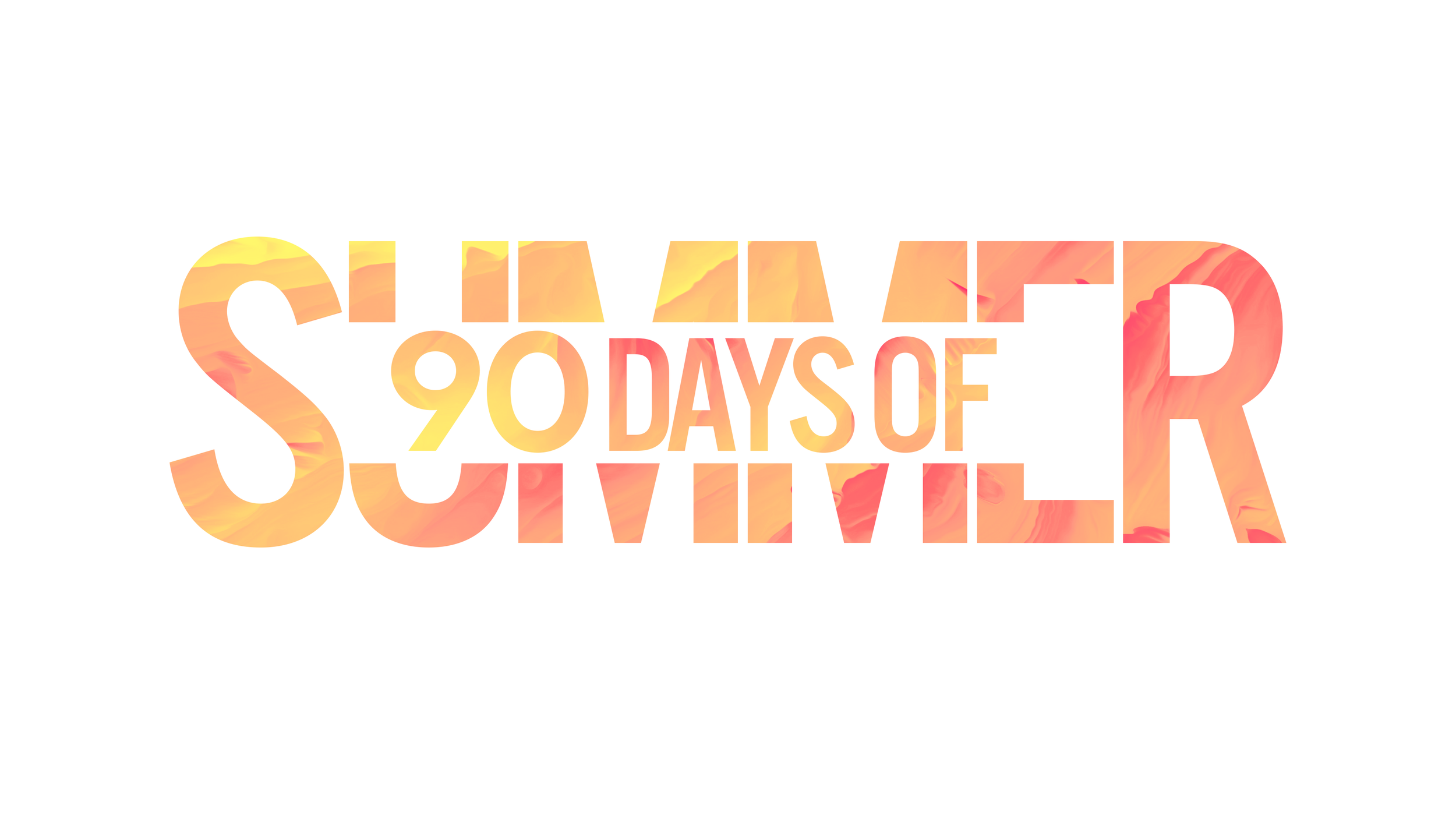
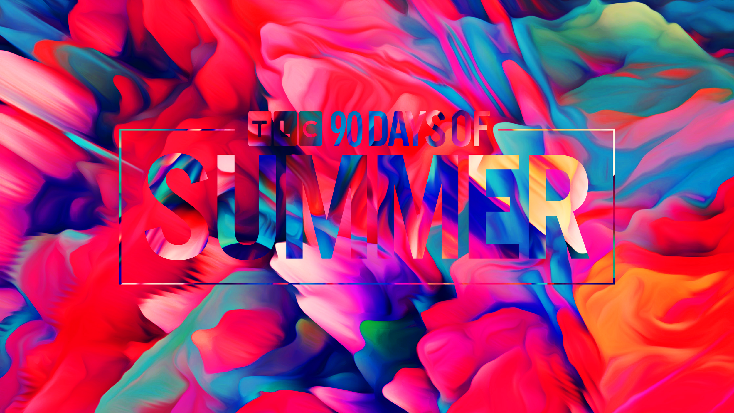
TLC needed a seasonal graphics package for 90 Days of Summer that could give the programming block its own bold, instantly recognizable identity.
The Process:
I developed a visual system built around saturated color, fluid textures, and a fiery, psychedelic summer aesthetic. The package combined distorted organic imagery, bold typography, and punchy animation to create something energetic, playful, and deliberately over-the-top.
The Outcome: