%404x.png)
The Brief:
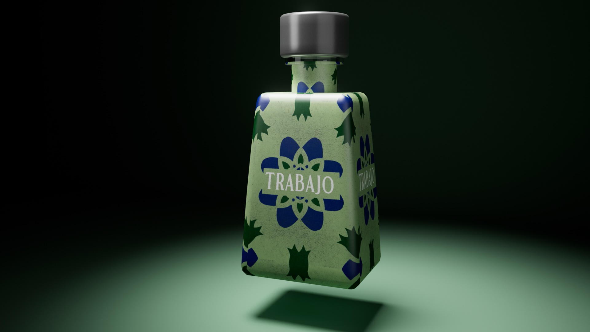
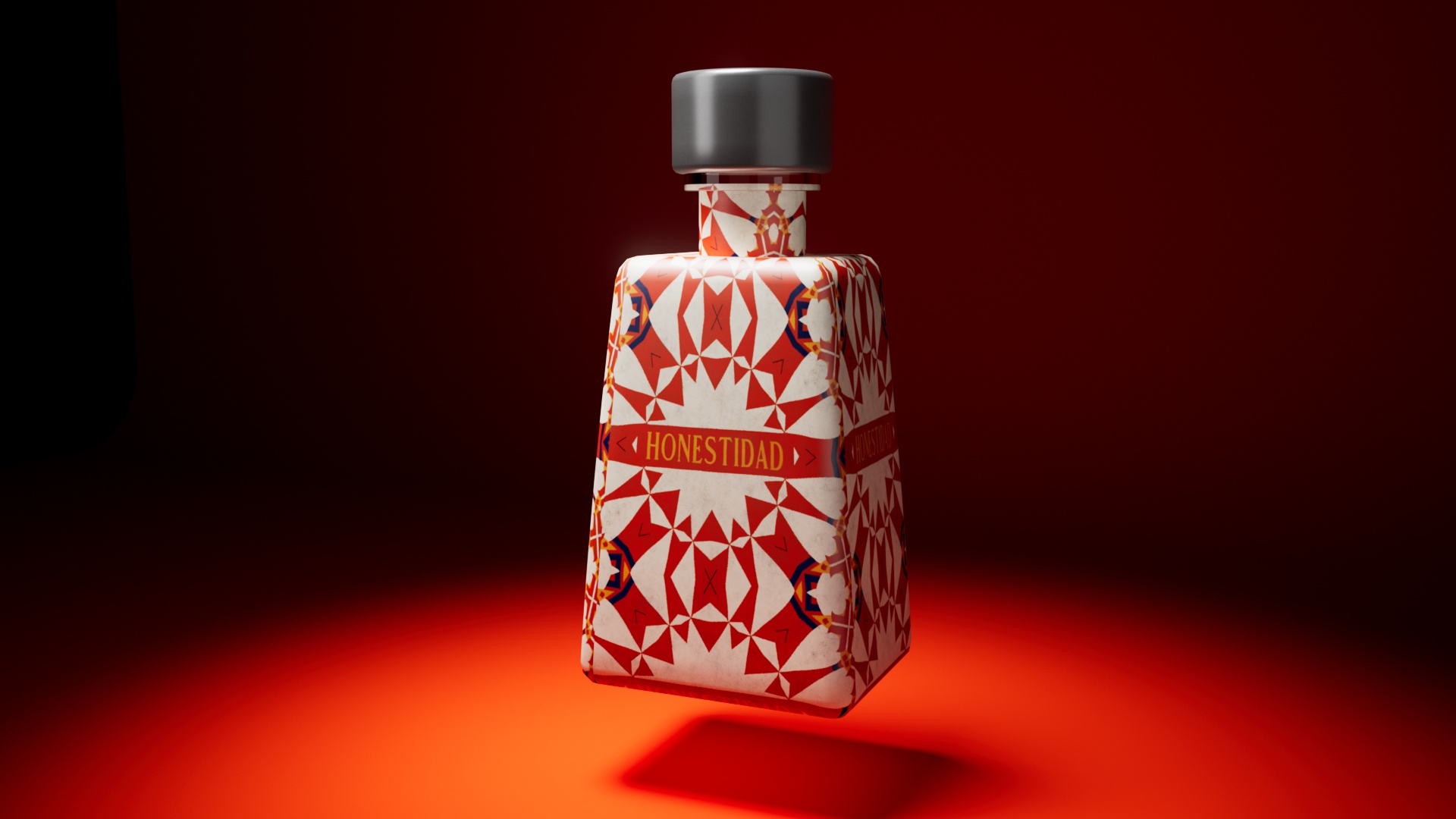
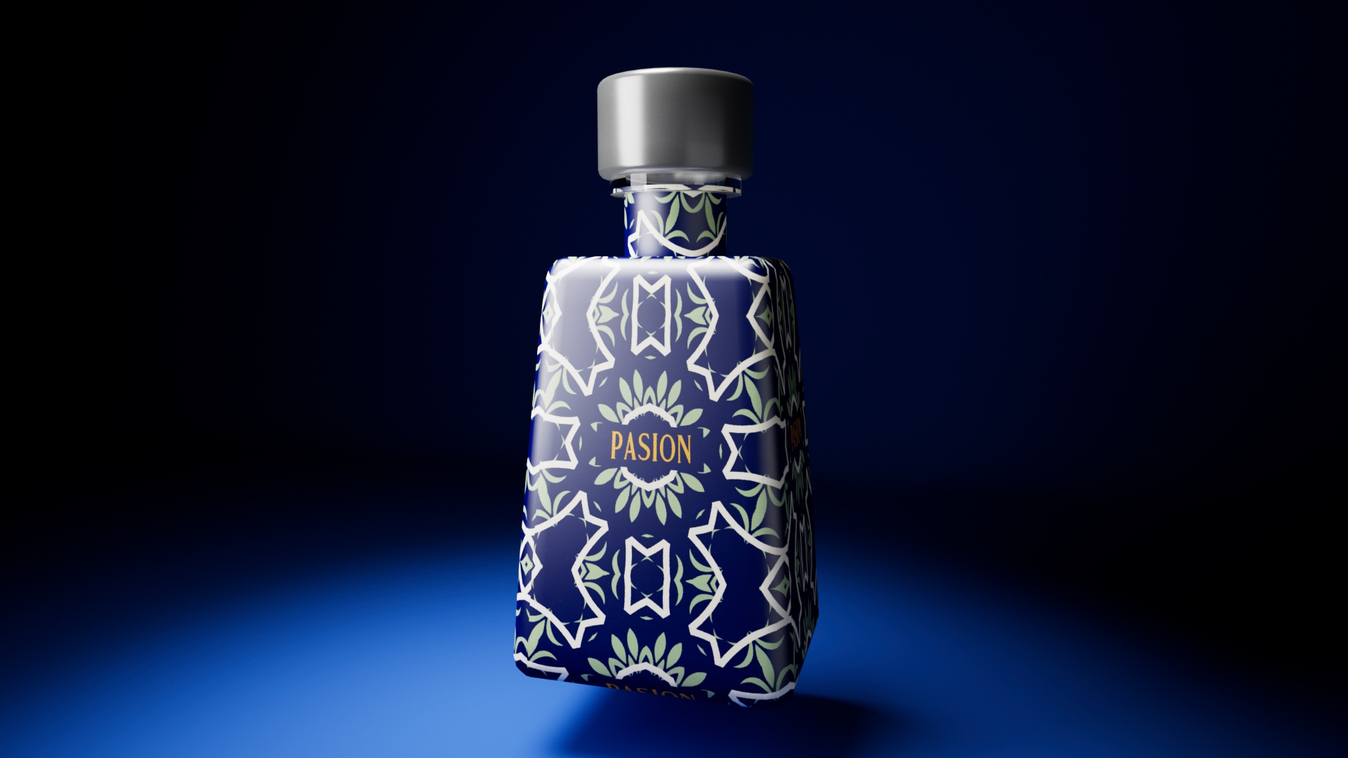
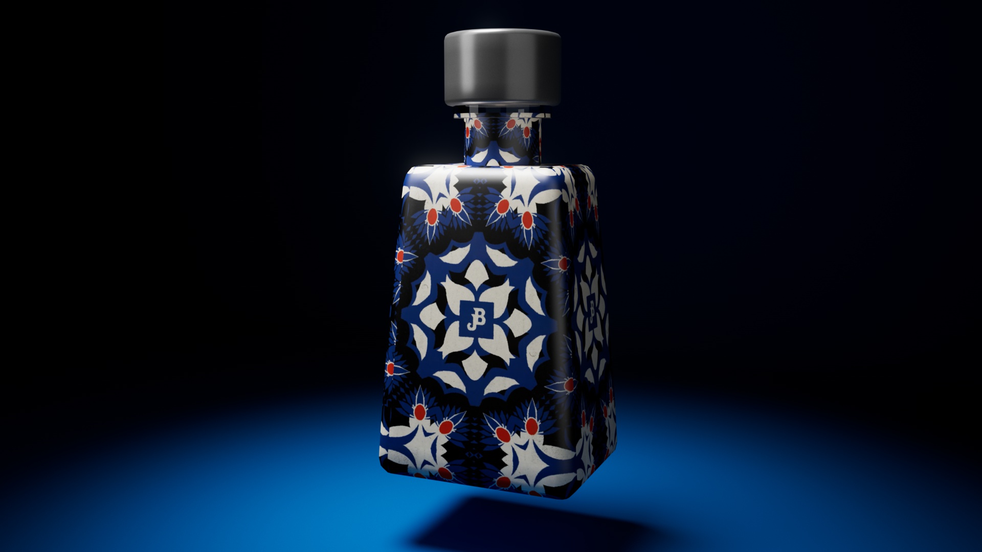
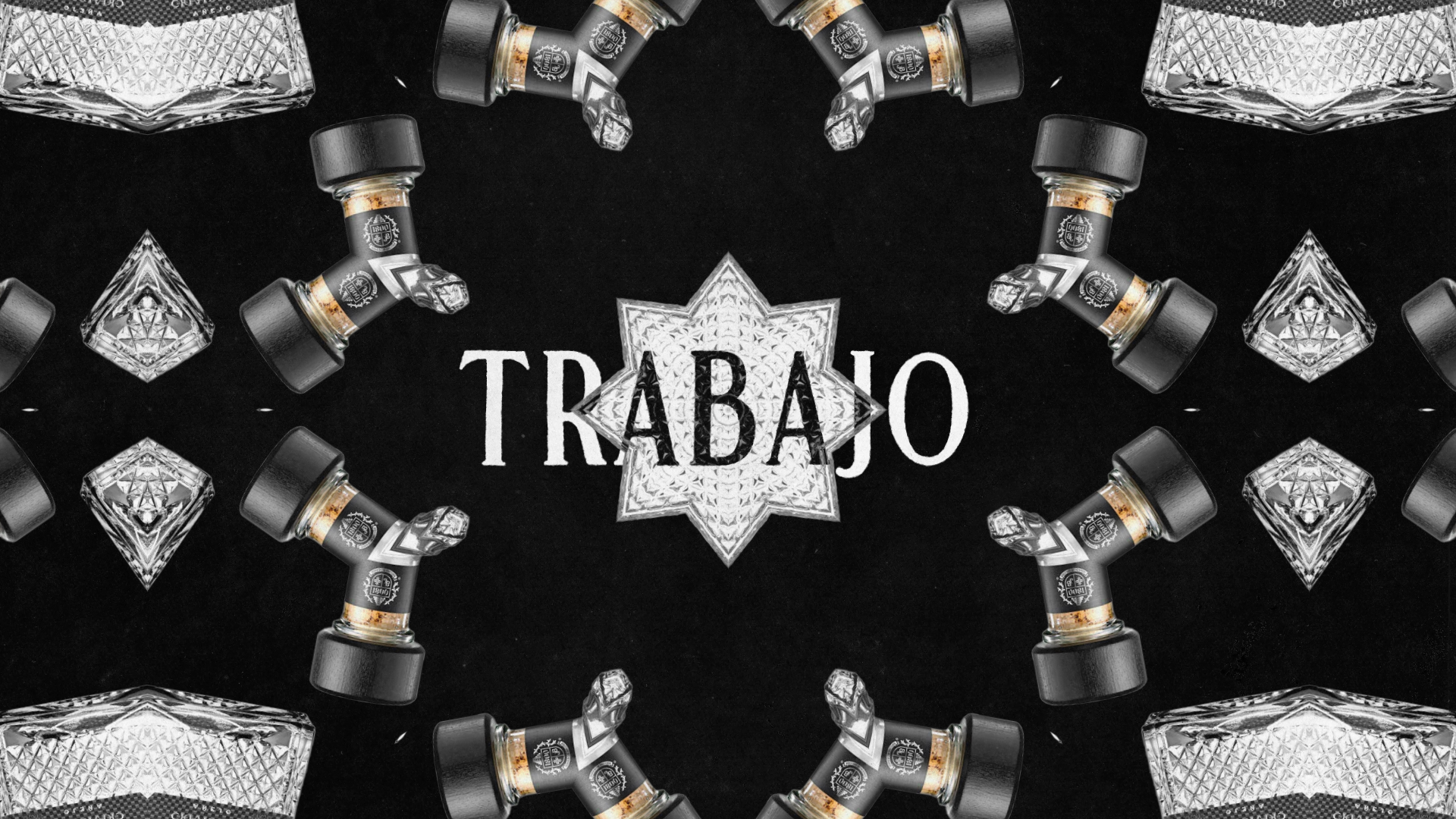
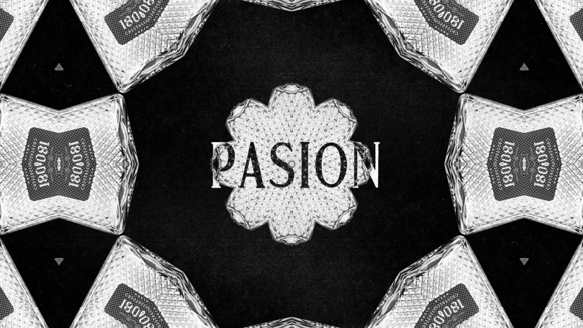
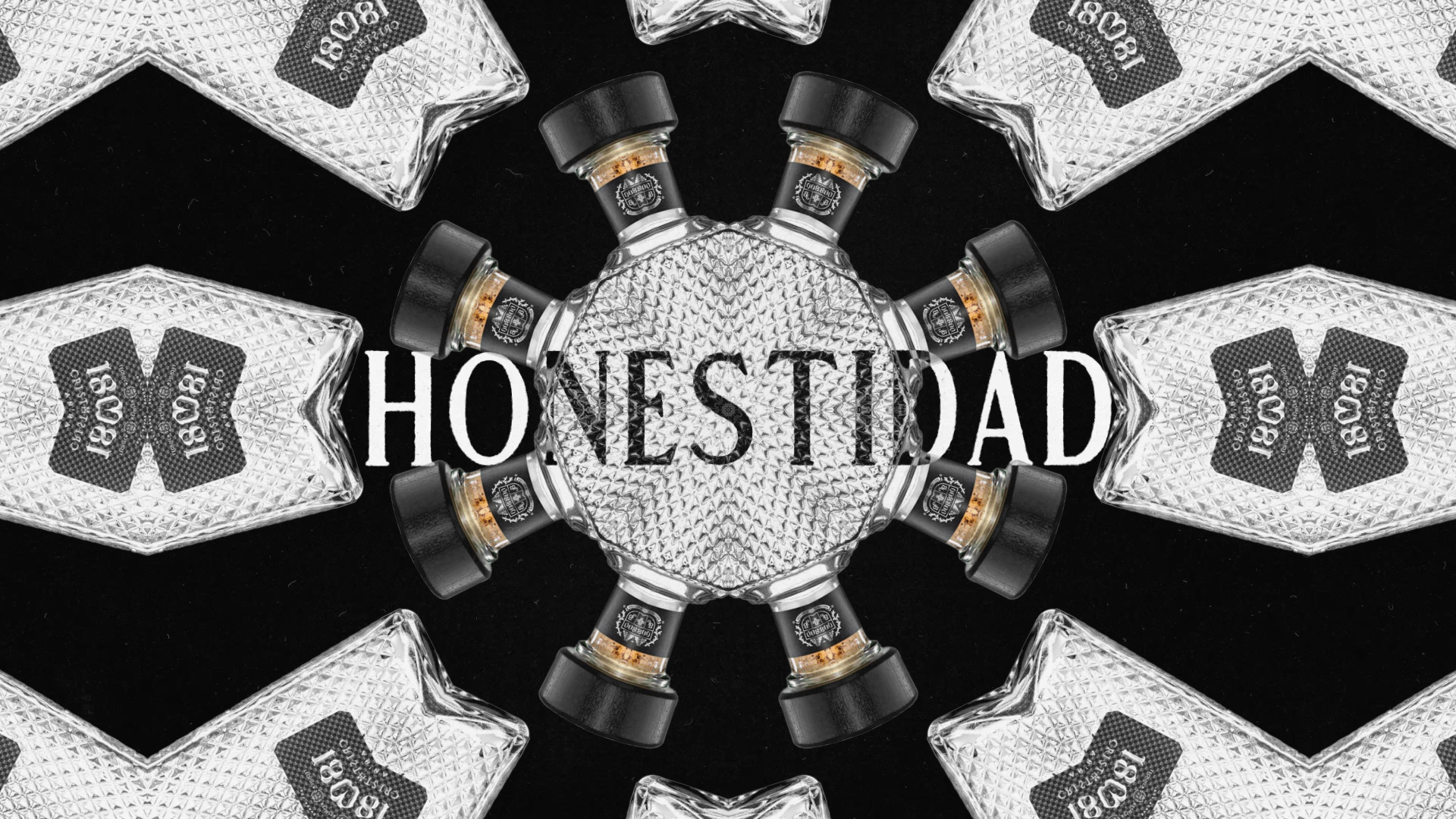
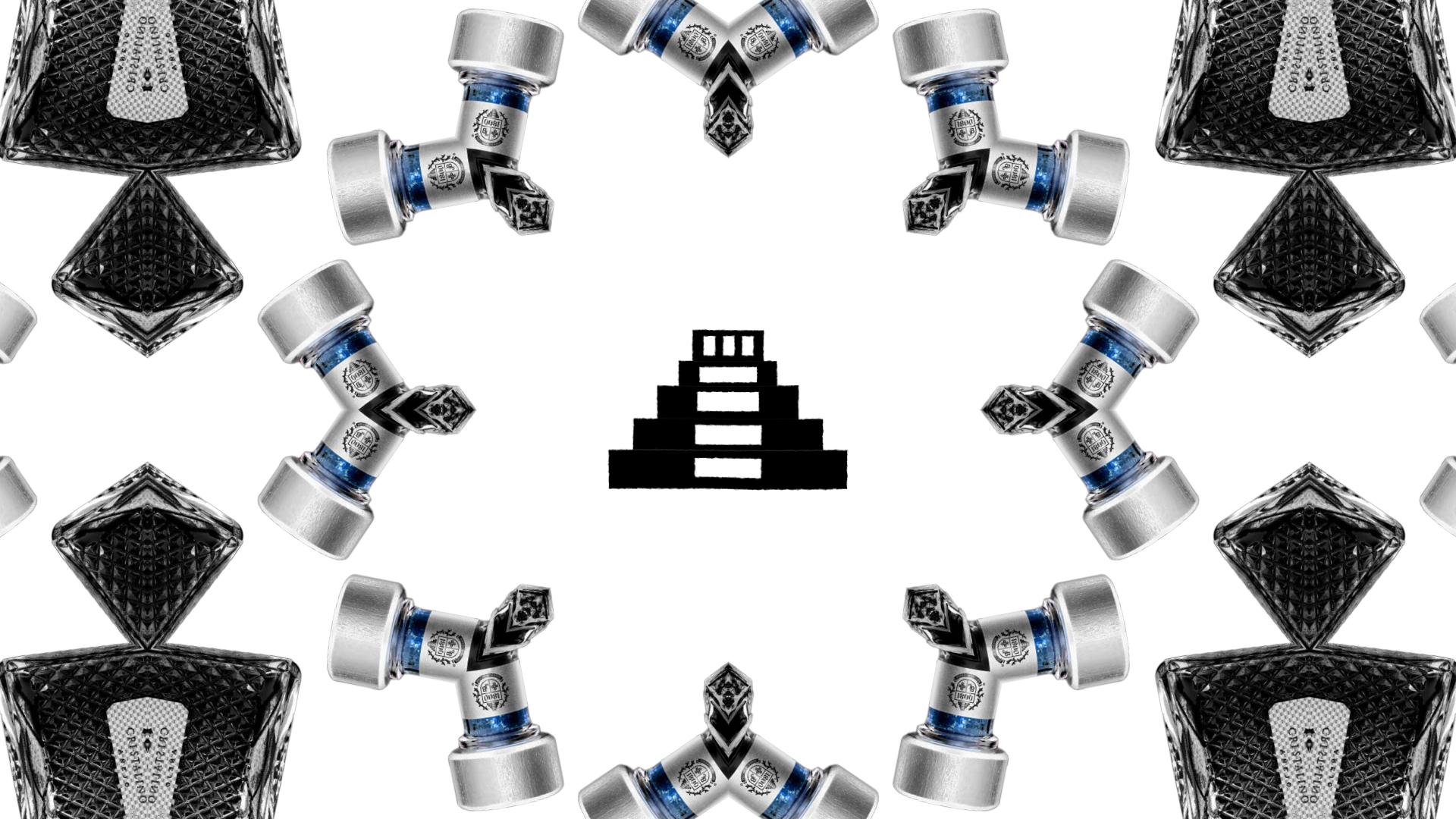
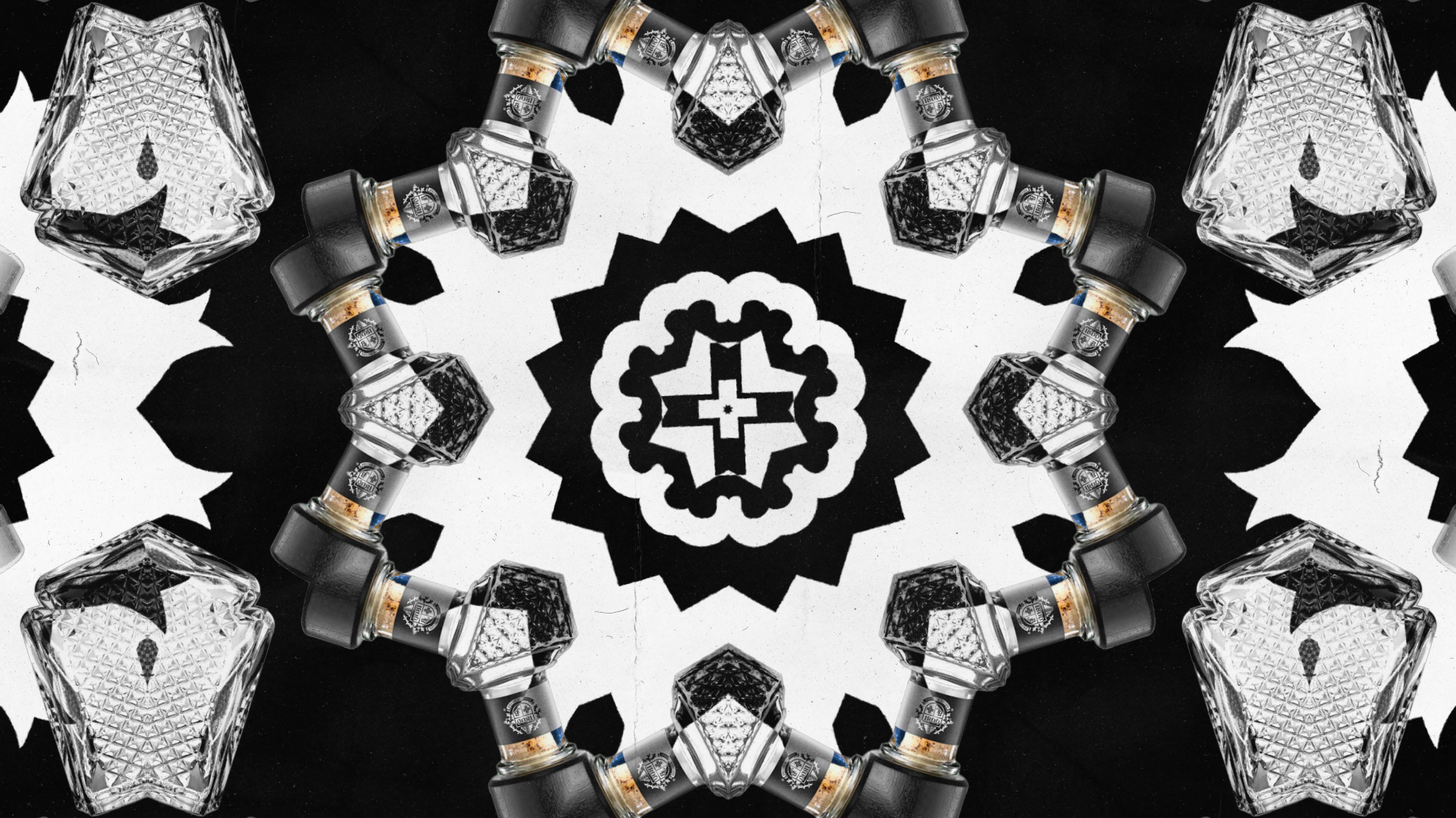
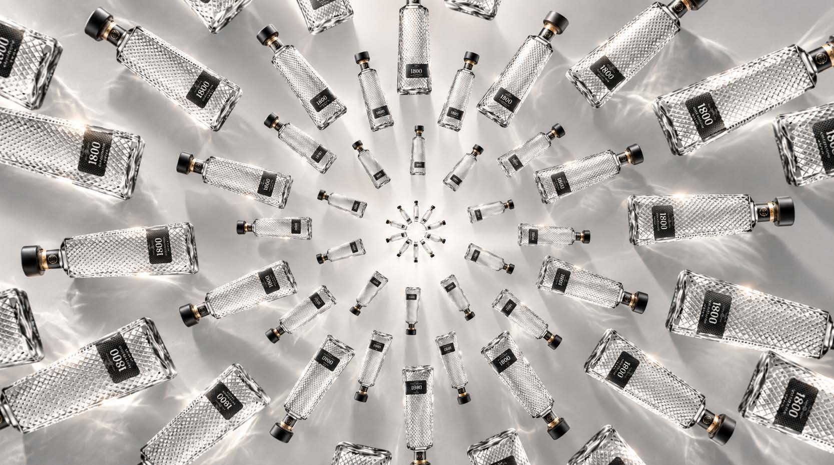
1800 Tequila was exploring a new packaging direction and needed a bold visual concept for a pitch centered around pattern, color, and the brand’s distinctive bottle architecture.
The Process:
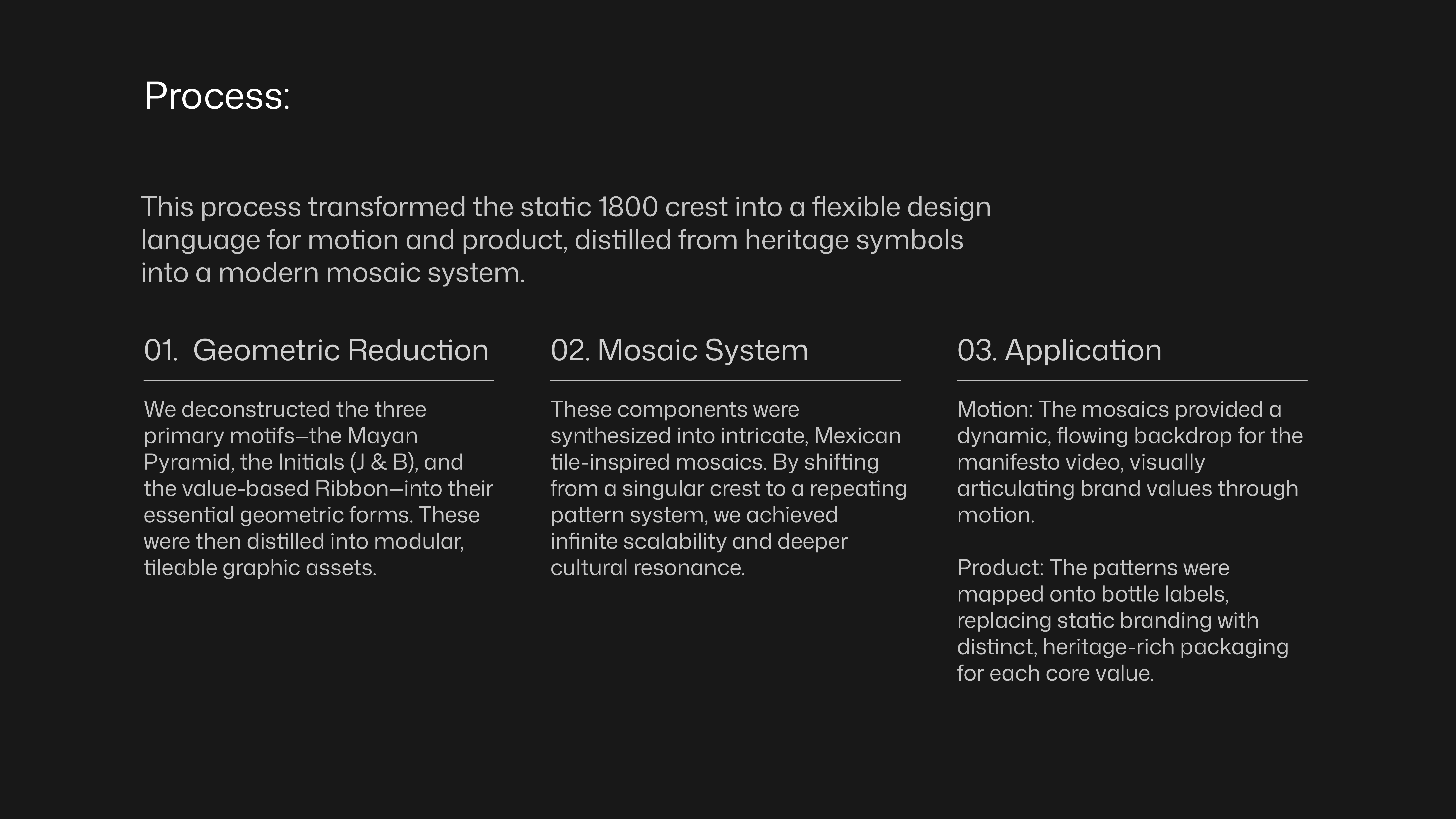
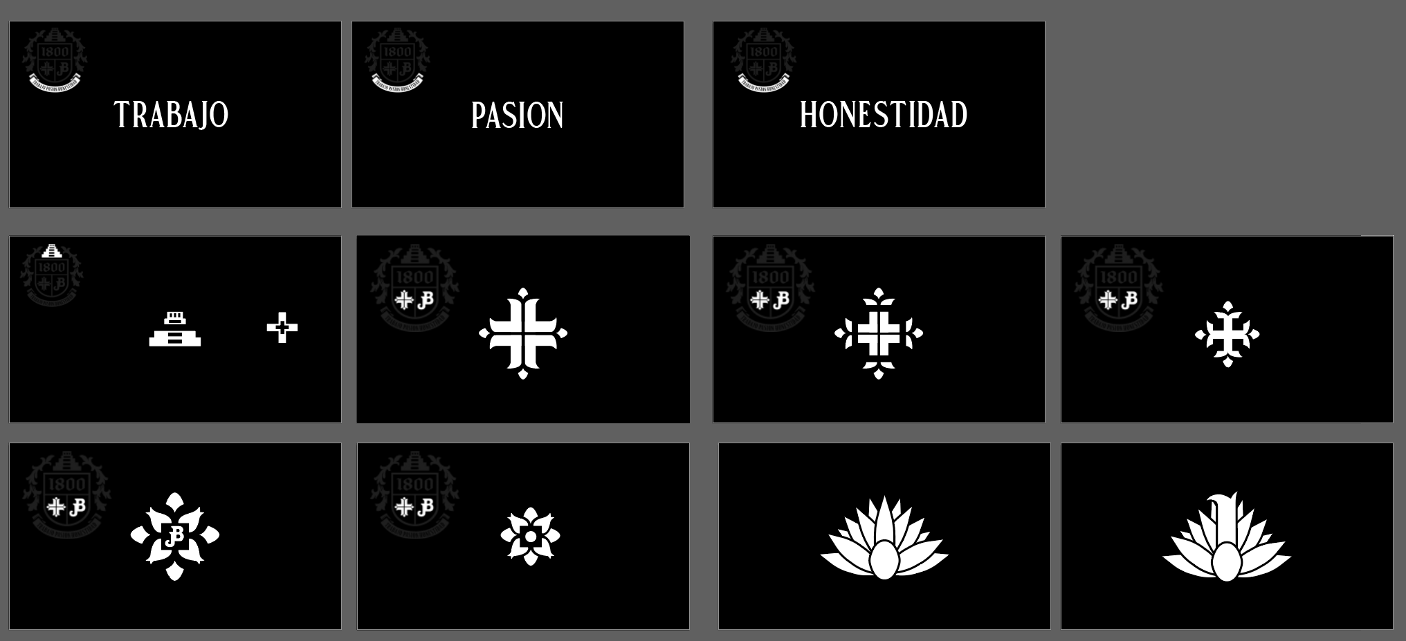
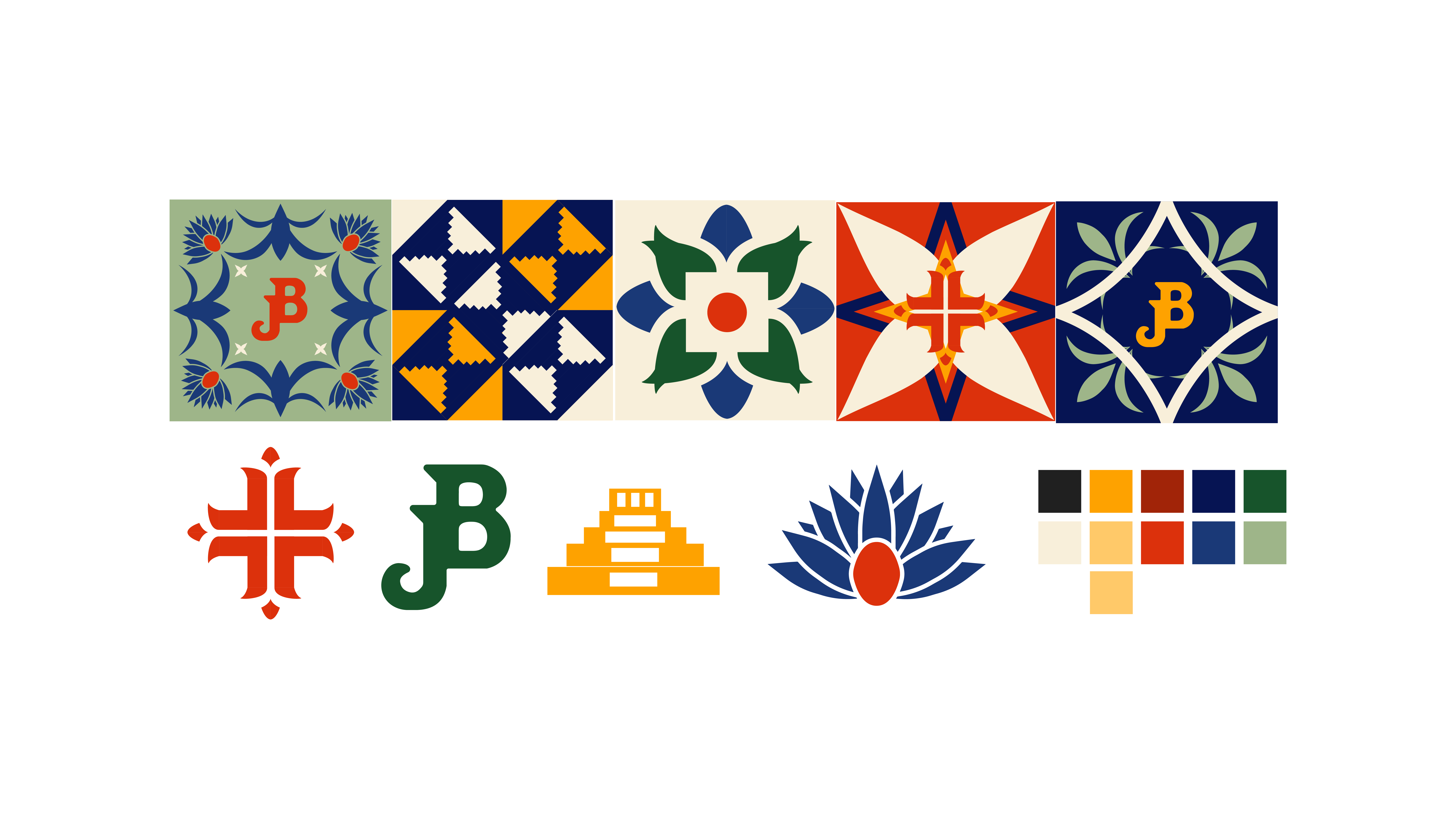
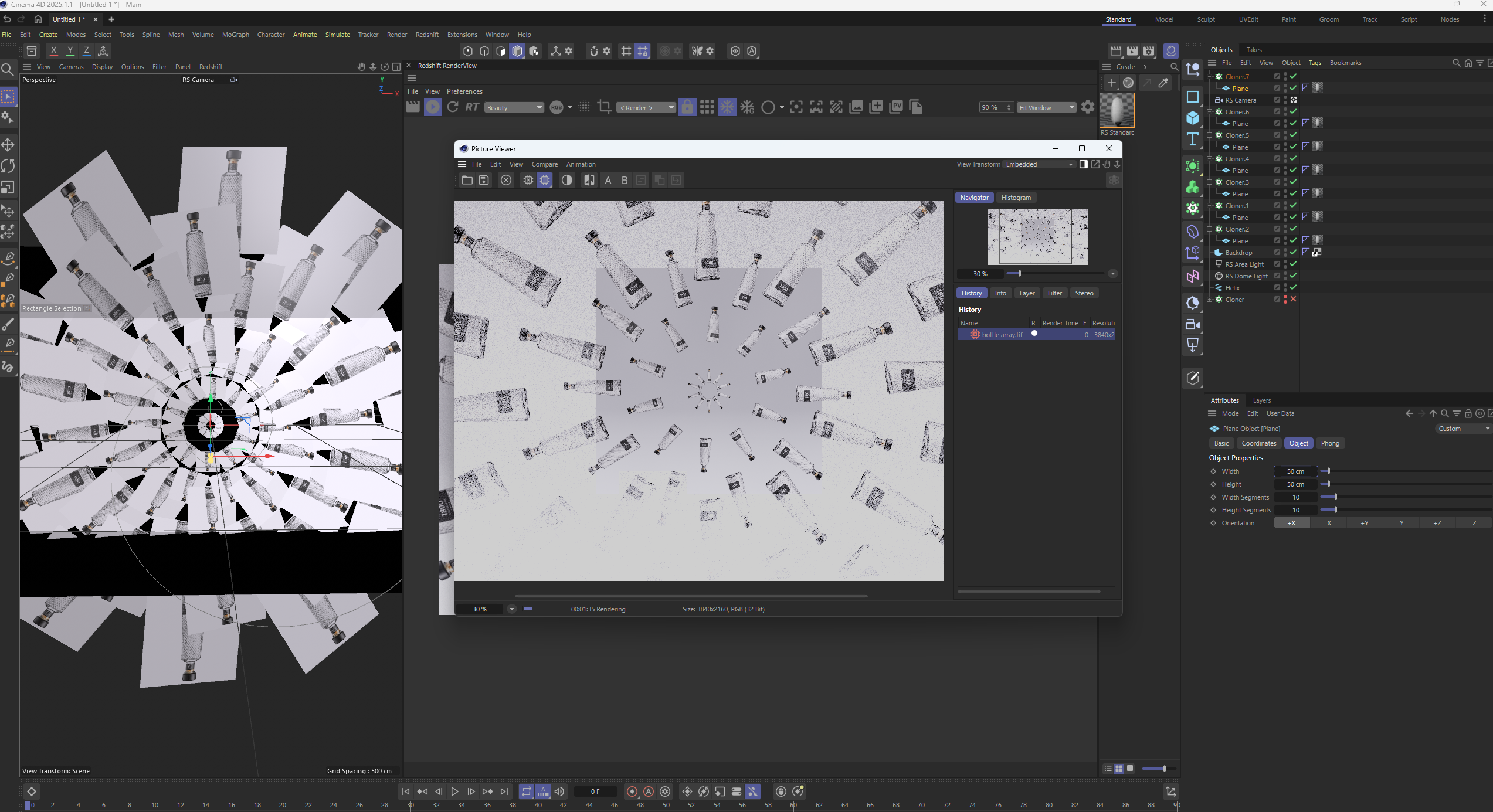
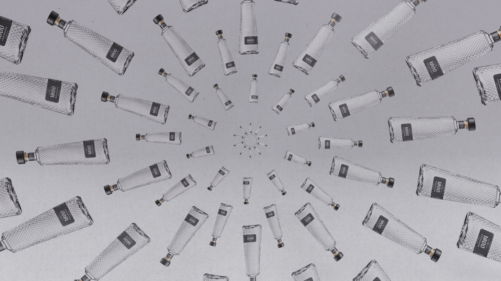
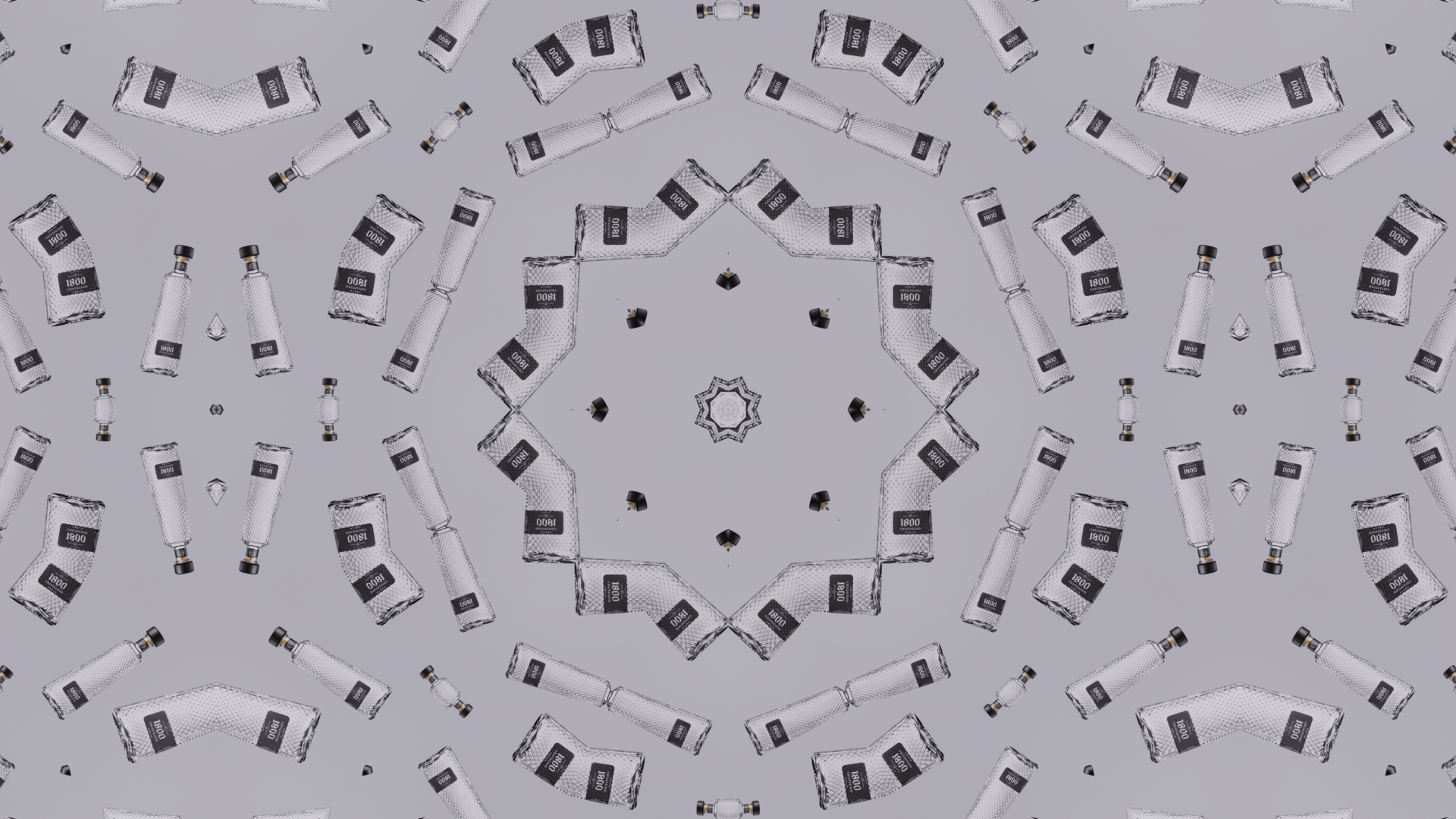
I developed a series of mosaic-inspired packaging concepts using repeated geometric forms, custom iconography, and bold color combinations. I then translated those directions into 3D bottle renders to show how the graphics could wrap around the form and behave under realistic lighting and materials.
The Outcome: